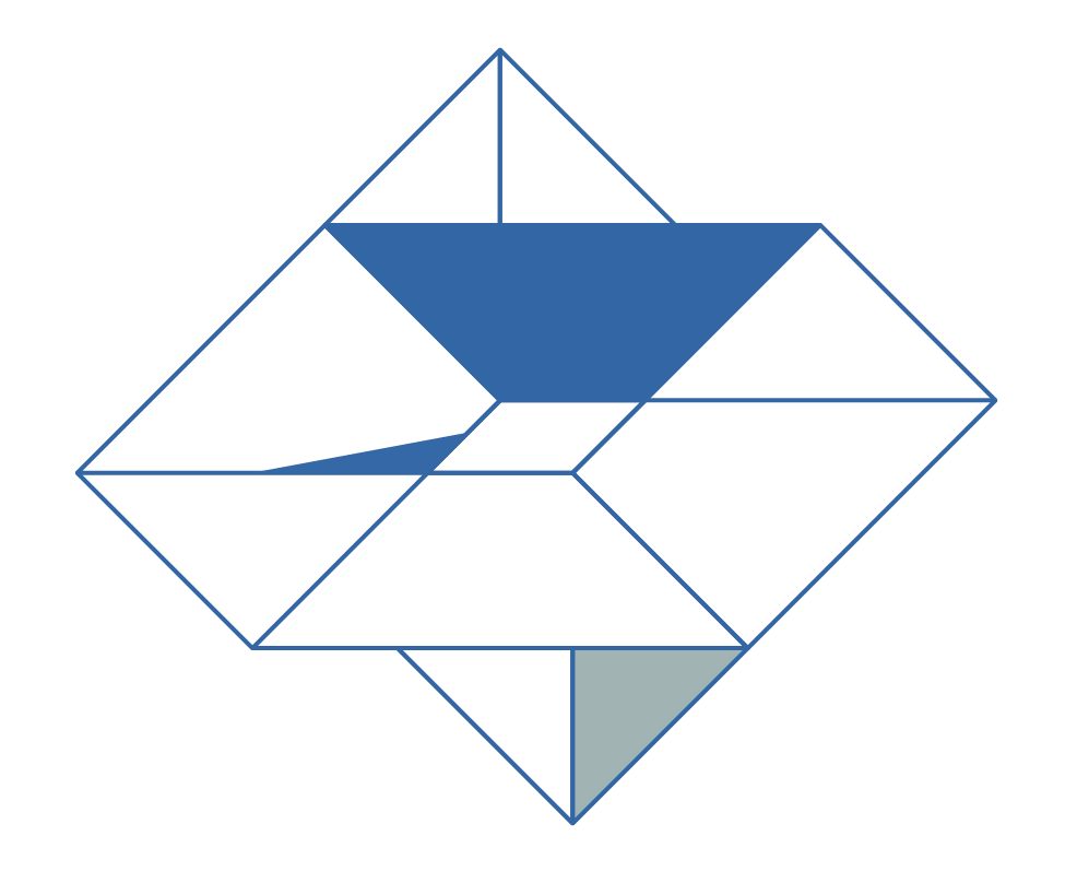
New Design: here we are's visual identity
Some of you might know the feeling of having everything settled. Nice house, nice jobs, great school for the kids, family and good friends around you. But you miss something. Something adventurous or something unpredictable. And you decide to just do it. Quit your job, sell your house and suddenly it's no crazy thought, it's happening. Crazy maybe.
So that was what we did. We traveled to the other side of this planet. I am - among other things - a graphic designer and illustrator. When I first took a look at the here we are global webpage months ago, I knew about here we are global from founder Jannie Aasted Skov-Hansen, I had just traveled to the other side of the world with no clue what to do - which meant I finally had some time to spend with whatever I felt like!
Wow, what a blast! Time to be with the kids, explore, draw, be creative.I knew all along that I would not have a work permit in the States, which almost kept me from going. But eventually I looked upon it from another perspective, I started to see the opportunities. Among other things I told Jannie, that I would love to help her, if she ever needed some graphics. She was thankful and would like to have some illustrations for her webpage. Sure, no big deal, I could do that.
Once I started looking at the initial webpage of here we are global I found that it had a professional but static dull look with standard stock photos. But that did not match my understanding of the organisation. here we are global is an active global network for people on the move, the virtual identity should match that. So fast I realised that I did not just want to design a few graphic elements, but rather I offered to redesign everything, make a proper design manual and rethink the logo. In other words make a visual identity that matched the vision and ambition and give the network the attention it deserves.
The diamond.
The idea about a diamond was already there, shaped by Arleen, a Finnish graphic designer based in Bishkek. And the logo wasn´t bad at all. A diamond is very symbolic. It is known for it's energy, giving superior strength, enhancing creativity and open the mind to new and impossible. Skills surely needed for any expat. I decided to keep the colours, make the shape more simple. The hard part was actually to give it a hinch of a diamond without looking like all of the other diamonds out there. There are a lot, I can tell you ;)
My main focus was the over all look and feel of the whole identity. I wanted it to match the audience. Typically adventurous, open minded people, with a career going on, in the middle of their busy lives, taking a courageous step away from a more predictable everyday life. Half of my background as a designer is as an illustrator. So I used the lines and colours from the logo as inspiration for the illustrations. I wanted the overall look and feel to be fun yet professional, colourful but still tasteful. You have already seen many of here we are global's illustrations, and I have much more to come. Recently we have been developing an app, and more printed material is also on it's way. The latest in my sketchbook is here we are global's own emojis - I will share them with you soon.
So that crazy idea wasn't that crazy after all, I can say that now after having been abroad for a year. Not only have we had a lot of beautiful experiences in California so far. We have met wonderful people and had a lot of cultural 'aha moments', that have put our prejudices about America to a test. And I have been given the opportunity to make a new visual identity for here we are global.
Anne Bundgaard is an illustrator and graphic designer with management experience. She is a founding member and Creative Director of here we are global and currently based in San Fransisco, USA.

